Chain · Era 6 · WWII & Post-War
WWII & Post-War · 1934–Present

Redlining:
The Map That Built the Wealth Gap

Between 1934 and 1968, the federal government — through the Home Owners' Loan Corporation and the Federal Housing Administration — created color-coded maps of American cities that graded neighborhoods by investment risk. Neighborhoods with Black residents were colored red and rated 'hazardous.' Banks and the FHA refused to make loans in redlined areas. White families fled to FHA-guaranteed suburbs. Black families, trapped in redlined neighborhoods, could not build equity. The neighborhoods themselves declined from disinvestment. The maps were used for 34 years. Their effects are measurable today in property values, school funding, health outcomes, and the racial wealth gap.

HOLC maps created
1935–1940 — 239 cities
FHA discriminatory lending
1934–1968 — 34 years of federal exclusion
Legacy
Redlined neighborhoods still 74% non-white; $156K lower home values
The Central Argument

Redlining was not a private real-estate practice that the government tolerated — it was a federal government program that created the maps, set the lending standards, and enforced the exclusion. The Federal Housing Administration's Underwriting Manual explicitly instructed appraisers to mark down any neighborhood with 'inharmonious racial groups.' The government built the segregated suburbs, insured the mortgages that built white wealth, and systematically denied those same mortgages to Black Americans. When the Fair Housing Act of 1968 officially ended redlining, 34 years of compounding exclusion had already occurred. The wealth it had denied could not be restored by making the practice illegal.

The Maps · 1934–1968
01
1934–1940

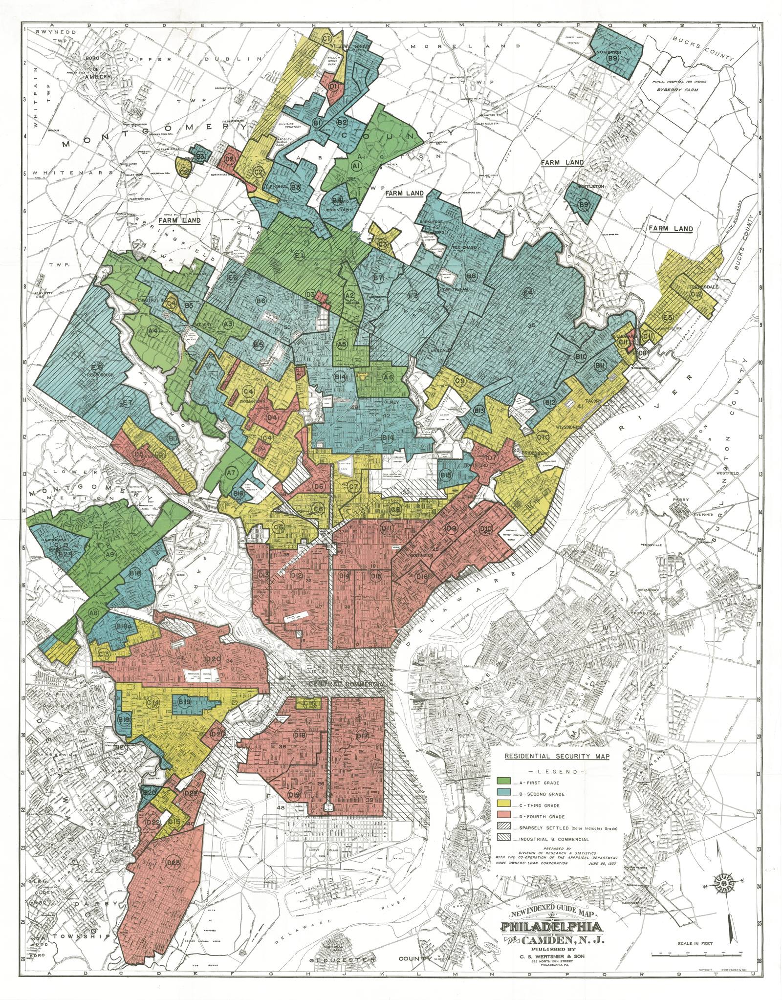
The HOLC Maps: The Federal Government Colors the Cities

239 American Cities
239
Cities mapped by HOLC, 1935–1940
"Hazardous"
Grade given to any neighborhood with Black residents — regardless of condition

The Home Owners' Loan Corporation (HOLC), created by Congress in 1933 to refinance mortgages during the Depression, sent appraisers to 239 cities to map neighborhood investment risk. They used four grades — A (green, "Best"), B (blue, "Still Desirable"), C (yellow, "Declining"), and D (red, "Hazardous"). The determining factor for a D rating was not building quality, employment, or infrastructure — it was race. Any neighborhood with Black residents was automatically rated D regardless of its actual condition. The maps described Black neighborhoods as hazardous because Black people lived in them.

The maps were used by banks, the FHA, and the VA to determine where they would lend. Redlined neighborhoods were denied mortgage loans, home improvement loans, and business loans. Without access to capital, property owners could not maintain their buildings. Neighborhoods declined — producing the condition the maps had predicted through the mechanism the maps had created. Redlining was self-fulfilling prophecy enforced by federal policy.

02
1968–Present

The Lasting Map: What Redlining Looks Like Today

United States
74%
Non-white population in formerly redlined areas today
$156K
Lower median home value in formerly redlined vs. non-redlined areas

The Fair Housing Act of 1968 made redlining illegal. The maps' effects were not reversed. A 2018 analysis by the National Community Reinvestment Coalition found that formerly redlined neighborhoods — mapped 80 years earlier — remained 74% non-white and had home values $156,000 lower than formerly green-rated areas in the same city. The segregation the maps encoded persists. The wealth the maps denied has not been restored.

The legacy runs further than property values. School funding in most states is tied to local property taxes — meaning that lower home values in formerly redlined neighborhoods produce lower-funded schools. A 2020 study in Climate found that formerly redlined neighborhoods are an average 2.6°C hotter in summer than non-redlined areas due to the deliberate absence of trees and green space in redlined maps. The maps made their neighborhoods hotter, poorer, and less educated — and those effects compound across generations with no intervention to reverse them.

"We shape our cities, and then our cities shape us."

— Adapted from Winston Churchill — the HOLC maps shaped American cities. The maps are still shaping Americans.
The Map's Legacy

The maps from 1935 predict today's segregation. They are still doing work.

The HOLC maps are the most visible single artifact of how federal policy built the racial wealth gap. Every thread about Black housing, health, education, and wealth connects back to these maps.